I’ve written before about those who have criticized DePaul’s decision to go test-optional in freshman admissions. Much of the criticism is from people who believe that we’re doing this is to artificially increase the freshman average ACT scores we report. So I did some work to see how plausible that approach might be. And from that work came two important points, both of which are important to me; I hope that one or the other proves to be interesting to you.
After running a quick analysis by year of all enrolling freshmen for the baseline, I decided to create a “Lake Wobegon” model, where everyone in our freshman class is above average. I re-calculated the class ACT average, using only the scores of students who scored at least 21 on the ACT. (If you’re from the East or West Coast, here is an explanation of the distribution of ACT Scores.) The median score is between 20 and 21.
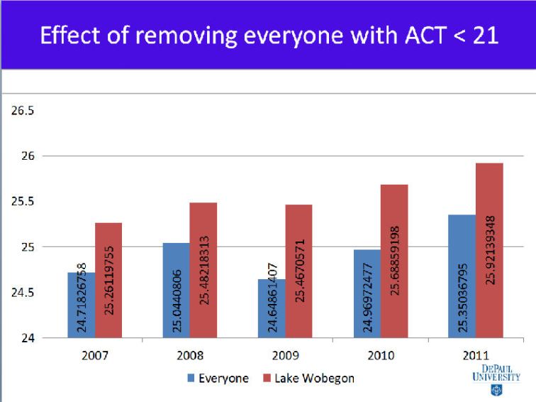
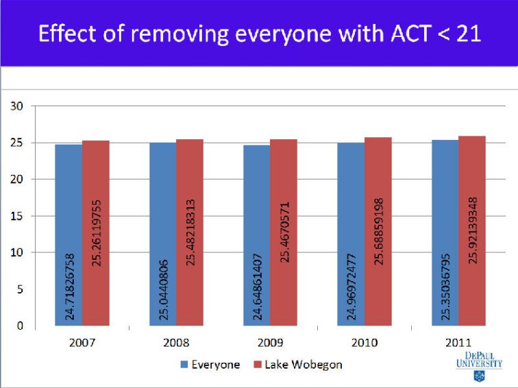
Here is what I got, using Excel. The actual scores of our freshmen in the given year is in blue; the Lake Wobegon scores are in red. You can click on these images to see them larger if you’d like:
WOW. What a dramatic effect, right?
Not really. Here is where Excel’s most annoying tendency comes in: It thinks it’s smarter than you, and shortens the y-axis, because it thinks you want to make very small differences noticeable to the viewer. Note that in this chart, the bottom is set to 24.
In this case, I don’t want to exaggerate differences. I want to show reality.
How to fix? Let’s try labels. I ran the decimal places way out so you could see for yourself the actual numbers:
Yet, this is even worse: Your eye is telling you one thing, while your brain tells you another. What are actually very small numeric differences appear to be large.
So, do this: Always (well, almost always, unless you have a really good reason not to) set your y-axis to zero. Now, look at the visualization, and tell me if it lines up with the numbers.
I like this demonstration for several reasons: First, it shows with some certainty the futility of attempting to manipulate average test scores by going test-optional. As I’ve also said before, if that were our intent, there are many far-easier ways to do so.
But equally as interesting to me is looking at the way our most common data visualization tool, Excel, so frequently gets it wrong on so many levels. I know better, but too many people doing this don’t and it contributes to bad analysis and often bad conclusions. Don’t let Excel do your thinking for you. Tell the story you want to tell, not the one Excel thinks you want to tell.


Hi Jon,
Try an iceberg chart (http://principalbi.com/2012/01/16/its-only-the-tip-of-the-iceberg/). It solves the problem of visualizing both the small variances at the margin and orienting yourself to the full absolute values.
– Karl.
LikeLike