There are very few people who understand that Enrollment Management is, at some level, an exercise in managing trade-offs. Even though the old Michelob Light commercial suggests that you can have it all, in fact, you can’t. And in reality, if you could, you wouldn’t be working in higher education. (Those of you who know me also know I like good German and American beer, but I’ll keep my comments about Michelob Light to myself for now.)
So, helping people understand trade-offs is a critical component of working in Enrollment Management: If you want to push up or down on quality, quantity, diversity, or net revenue, the market is going to be more than happy to push back on you, often harder and more dramatically. But very few people outside of Enrollment Management understand this; those who do grasp the concept of trade-offs probably don’t have the time or the inclination to dive into the details to see the nuances.
My job is essentially trying to hit a sweet spot: Managing to generate enough net revenue to pay the professors, heat the buildings, buy computers, and keep the library stocked with academic journals and important books; keeping quality as high as we can in light of the need to pay the bills; and not ever giving up on a critical component of our mission to educate those whose economic situation might not normally assume a private university education, because offering low-income students anything less than a top-quality education only adds insult to injury. Keeping these things in balance is vital to accomplishing what we set out to do. And we re-invent the way we do it every year, because the number of students in the world is fixed, and competition is pretty fierce. On top of it all, every university has a different recipe for success.
Historically, we’ve managed this delicate and ever-shifting balance by using SPSS and Excel to examine the relationships between and among the variables we are interested in; typically, we spend several days a year doing nothing else, and it often involves Powerpoint decks of literally hundreds of slides. When your attention span is as short as mine, I guarantee you lose something important while day dreaming.
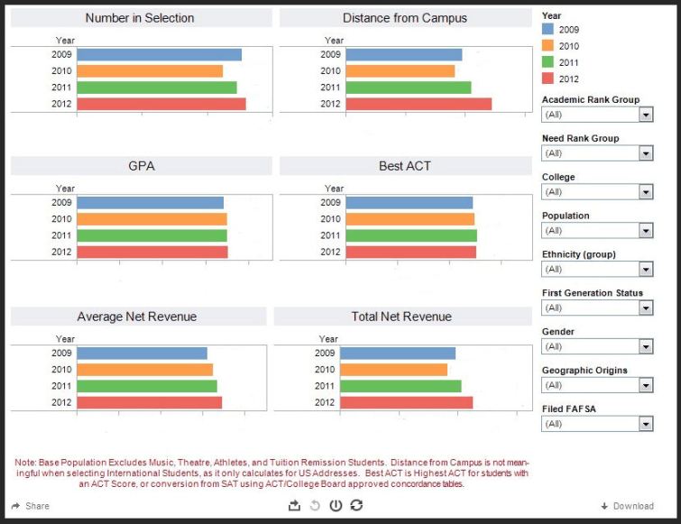
So, for internal use and to illuminate the balancing act, this year I took four years of data and rolled it into my favorite visualization tool, Tableau Software. In the interest of full disclosure, I’ve served on their Customer Advocacy Board, because I’m a fan, not because of the free T-shirts, or the beer I’ve been promised by my former account manager for five years now! I have no financial interest in the company.

The data is confidential, of course, so I can only show you a screen shot, which has been sanitized by removing the values and the axis labels. But look at this: With just a click or two, you can make a shallow or a deep dive to see the give-and-take between and among a handful of variables: Which students have the highest GPA? How much do test scores vary by financial need? Are men or women better students (as if we don’t already know the answer to that one!) What percentage of our first-generation college students are from Illinois? Who helps us accomplish our mission? Who helps us pay the bills? Which college has the most attractive students? OK, perhaps that last one is not in the data set. But you get the idea.
If you work in EM, you owe it to yourself to explain to your campus community the ins and outs of your profession; if you work in higher ed but not in EM, you owe it to yourself to educate yourself about how these important variables relate to each other. How you do that is up to you, but I strongly recommend against a 247-slide presentation. You can do better.
I thought this was going to be about the trade-offs you make in life because you work in EM, but this was good too. 🙂
LikeLike