I’ve updated my IPEDS Data Visualization. I am never completely happy with it, but I think this does a nice a job of showing important information in a concise manner.
But it takes a few minutes to learn how to use it.
When you click on the link, you’ll go to a page that looks like this:

First, the data shown: The red label indicates the college or university. The grayish bar shows the freshman admit rate, sorted from lowest to highest (left-to-right). On that same lower pane is the six-year graduation rate for that institution, shown as a orange diamond.
On the top panel are SAT and ACT scores of enrolling freshmen, shown as math and reading (SAT) 25th and 75th percentiles and composite score (ACT), also shown as 25th and 75th percentiles. That means that if you lined enrolling freshmen students up from lowest to highest, a quarter would be below the 25th percentile, and a quarter would be above the 75th percentile. The rest would be in the middle 50%.
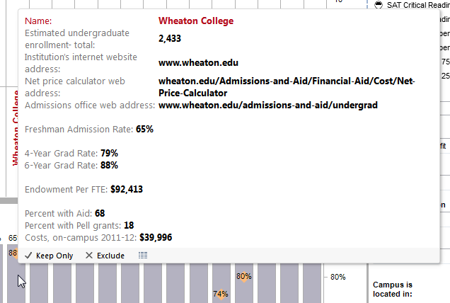
Note that when you hover over a bar, a box pops up, with all sorts of good data, like this:
Right now, it’s important to note that IPEDS data is not adjudicated. I know there are some mistakes in here, either caused by human or technical errors, or even, willful deception. It happens, so don’t place any bar bets on this data being correct. If you work at a college and you see mistakes, talk to the person who fills our your IPEDS Surveys.
With regard to interaction, you’ll find that you get better insight into the data if you filter to look at smaller sets. That’s what the boxes on the right side panel are for. You can seek a particular college by typing its name in…try Harv just to see what I mean (and you know you want to anyway…). Just backspace out to get back to normal.
You must choose either public or private, and a region. You can also choose urbanization, selectivity ranges, or state (but note that these last three are driven by other filters. For instance, if you choose “New England” you won’t be able to choose “Iowa” because it’s in the Plains group. Got it?
Give it a go. Click here to get started.
