If you live in Illinois, you should know about the Illinois MAP (Monetary Award Program), which has helped millions of students earn a college degree.
And you should know that almost every year, someone suggests that the funding should be removed from private universities, which they apparently think of as bastions of the wealthy. So, in response, a couple of things:
First, MAP Awards. Take a look at the data for yourself. When you go to the dashboard, it’ll look like this:
I’d suggest you start by filtering out the community colleges, so that you’re comparing four-year private colleges to four-year public colleges and universities. What you’ll notice along the top is a couple of things: First, the number of students who receive MAP is about proportional at private and public four-year colleges. More important, look at the employment numbers (far right) and you’ll see the economic impact of the MAP Investments each year. Compare this expenditure (total MAP awards) to total jobs. Then ask where the state gets any better return on its money, both in terms of economy and educated citizenry.
And, in case you’re interested, you can see the mean family income of the recipients for each individual college in Illinois. Surprised that the publics and privates are so similar? You shouldn’t be.
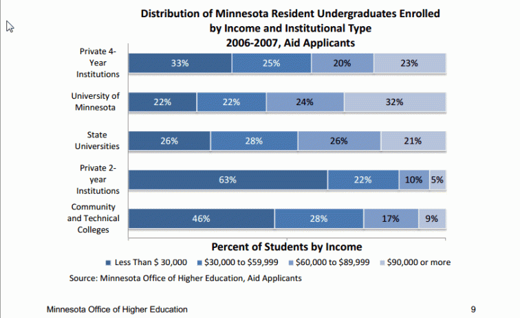
This made me wonder about studies I remember from Minnesota and Ohio that showed median family incomes of students at public institutions in those states were actually higher than at private institutions. Look at this chart from for instance from the report by the Minnesota Office of Higher Education:
So, of course, I looked at IPEDs Data. And came up with this. Take a look at the whole visualization here (instructions on the site). And prepare to be surprised.


Jon, a great display of information, as usual.
LikeLike